Making aesthetically pleasing dot density Venn diagrams
Posted on Sun 14 April 2019 in Visualisation
Introduction
Venn diagrams are a very common and intuitive way to visualise sets and relative population sizes of different cuts of data. From a data visualisation perspective, Venn diagrams are used in several different ways to present data:
- Euler diagrams: A qualitiative overview of which sets overlap with others, and which sets are subsets of others (Euler diagrams are technically not Venn diagrams, but I have included them here because these types of diagrams are colloquially still referred to by many as Venn diagrams)
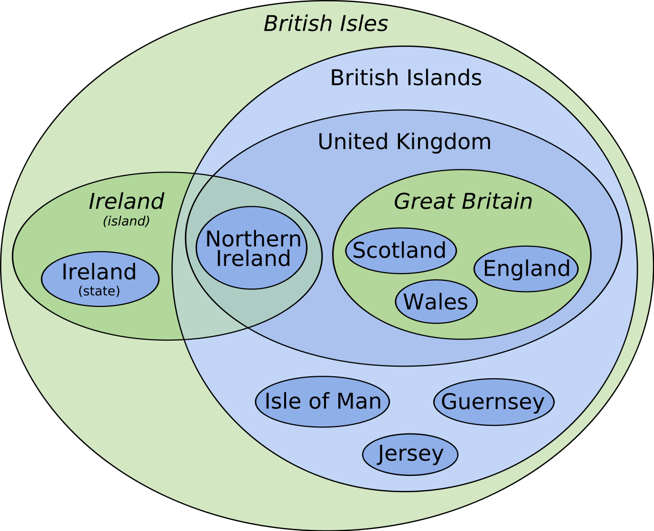
Source: Wikipedia
- Labelled population sizes in the diagram: These are a straight forward way to present the data, but from a perceptual standpoint, our brains aren’t very good at intuitively processing this. It’s only marginally better than presenting the data in the form of a table
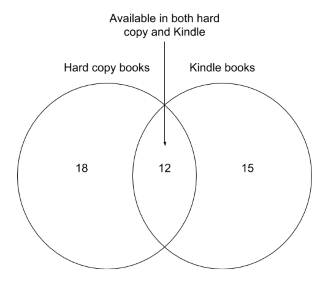
source: Geckoboard
- Area-proportional or scaled Venn diagram: These aim to scale the area of different regions of a Venn diagram so that they are proportional to the population of that segment. This can be quite a useful way to convey relative population sizes of the regions of the Venn or Euler diagrams, but geometric restrictions means that this can’t be accurately done with circles for cases with more than 2 overlapping sets (the number of degrees of freedom from altering relative size and distance between circles will be lower than the number of distinct regions in the Venn diagram for all cases with n>2). There are ways around this problem using triangles or irregular shapes for the 3-set or higher case, but it is likely that you will run into geometric limitations when presenting information in this way
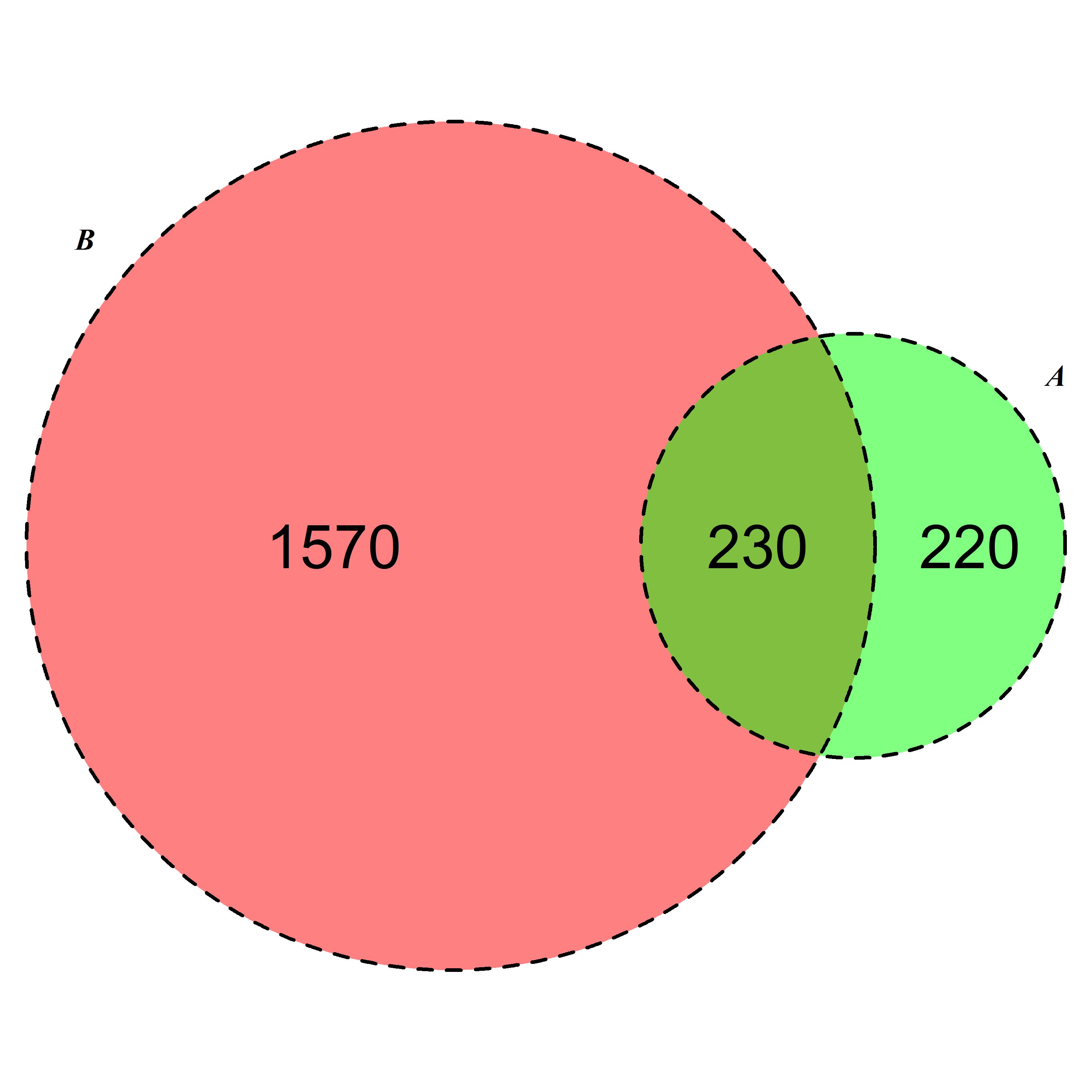
source: StackOverflow post
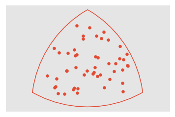
- Dot density Venn diagram: Another way to present more quantitative information is by populating the regions of the Venn diagram with icons or dots that represent the relative population of the region of the Venn diagram. This is a flexible way to present quantitative information that is also perceptually easy to process.
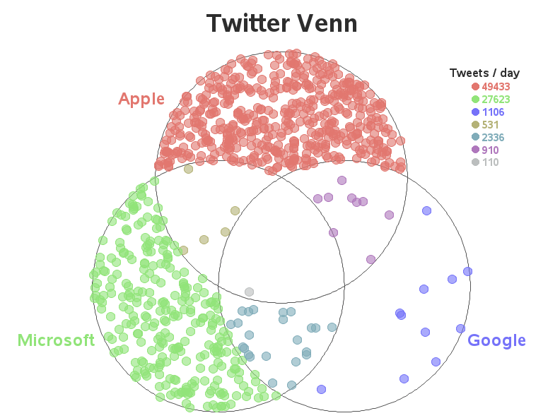
source: Robert Allison’s website
I generally like the latter as a visualisation approach because of its flexibility and perceptual interpretability. However, the way it is done is typically with randomly sampled points for each region or manually placed points in arbitrary locations within a region. I have always thought that these could look nicer if the points distribution within a region were approximately evenly spaced, so this blog post is my attempt at solving that problem.
Lloyd’s algorithm for pseudo-random sampling
Lloyd’s algorithm is designed to generate roughly evenly spaced points in space, so I’ll be using this as the key process for the pseudo-random sampling to create evenly distributed points. The way it works is heavily reliant on Voronoi tessellation. If you want to learn more about Voronoi tessellation, I can recommend this DataGenetics post introducing the concept.
Lloyd’s algorithm starts with a set of randomly distributed points, and then recursively generates the Voronoi cells for that set of points and moves the points to the centroids of the Voronoi cells. Each iteration of this process increases the uniformity of the spacing between points. Each step is visualised below:
-
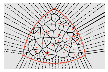
Start with a set of random points
-
Determine the Voronoi tesselation for that set of points
-
Move each point (orange) to the centroid (blue) of its Voronoi cell
We can see that this process increases the distance between points that are close together.
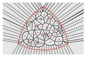
This process can be done recursively to keep increasing the distance between points that are closest together until the system reaches an equilibrium point, thereby generating an approximately uniformly distributed set of points. The animation below shows the effect of cycling through 30 iterations of Lloyd’s algorithm
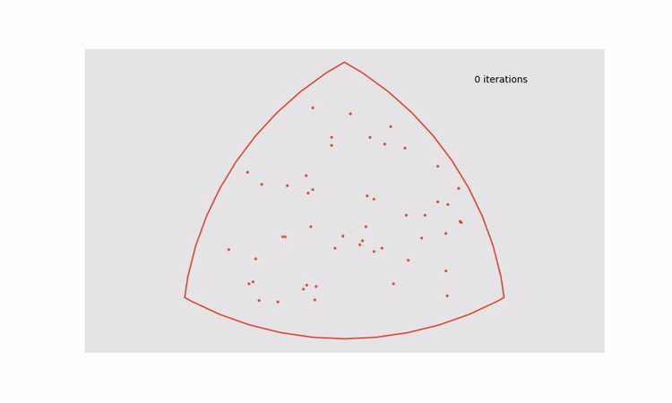
This approach can be applied to all regions in a dot density Venn diagram to turn the figure on the left into the figure on the right.

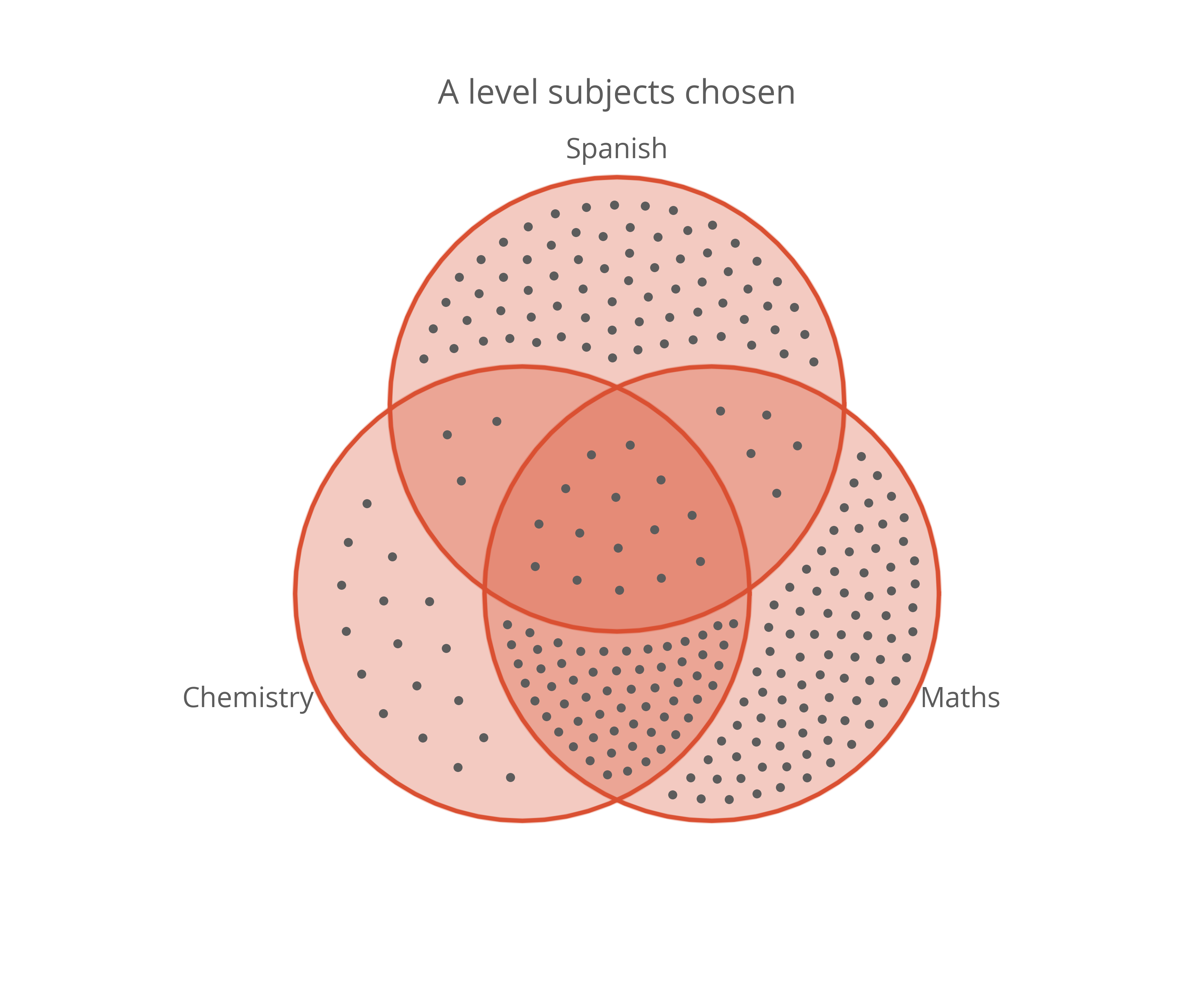
That looks much nicer to me and it doesn’t lose any perceptual accuracy. I think this might become my default choice for visualising population sizes in sets in the future.
If you’re interested in generating similar graphs, the code I used wrote to generate the Lloyd-relaxed dot density Venn diagram can be found here in the form of a Jupyter Notebook (Python).